
Proportion in Architecture and Interior Design

Article
Proportion in Architecture and Interior Design
Some rooms feel right the moment you walk in, even without a single remarkable object. Others are full of beautiful things yet still feel cramped or off-balance. Much of that difference comes down to proportion – the relationship in size between the parts of an object, between objects, and between a space and the people in it.

Proportion and scale – two often-confused ideas
- Proportion is the relationship between parts within one object or space: the height of a window against its width, the thickness of a tabletop against its legs, the length of a room against its ceiling height.
- Scale is the size of an object relative to other objects and to the human body. A sofa can be well-proportioned in itself yet still be "out of scale" if it is too big for the room or too small for the coffee table beside it.
Good design needs both: each piece beautiful in itself, and everything fitting together and fitting the people who use it.
The golden ratio – a rhythm from nature
The golden ratio (φ ≈ 1.618) divides a line so that the ratio of the longer part to the shorter equals the ratio of the whole to the longer part. A golden rectangle can be divided again and again into a square and a smaller golden rectangle, producing the familiar spiral.
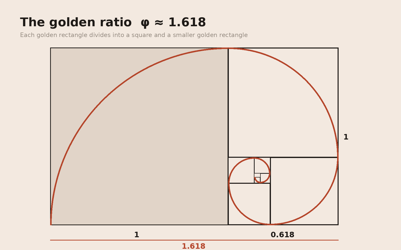
The ratio appears in many classical buildings and is used by many architects to tune facades, openings and layouts. In interiors, the simplest application is a roughly 60/40 split: about 60% of the floor for furniture and 40% left open for circulation and breathing room; or dividing a wall into two parts of roughly 1 : 1.6 rather than in half.
Still, the golden ratio is a tool, not a rule. Many beautiful spaces are built on simple ratios such as 1:1, 1:2 or 2:3 – as long as they are repeated consistently.
The human body as the measure
In Roman times Vitruvius argued that architecture should follow the proportions of the human body – an idea later illustrated by Leonardo da Vinci's "Vitruvian Man". In 1948 Le Corbusier published the Modulor, based on a 1.83 m tall man: navel at 1.13 m, raised hand at 2.26 m, with intermediate dimensions divided by the golden ratio. He applied it at the Unité d'Habitation in Marseille, where living-room ceilings are 2.26 m high.
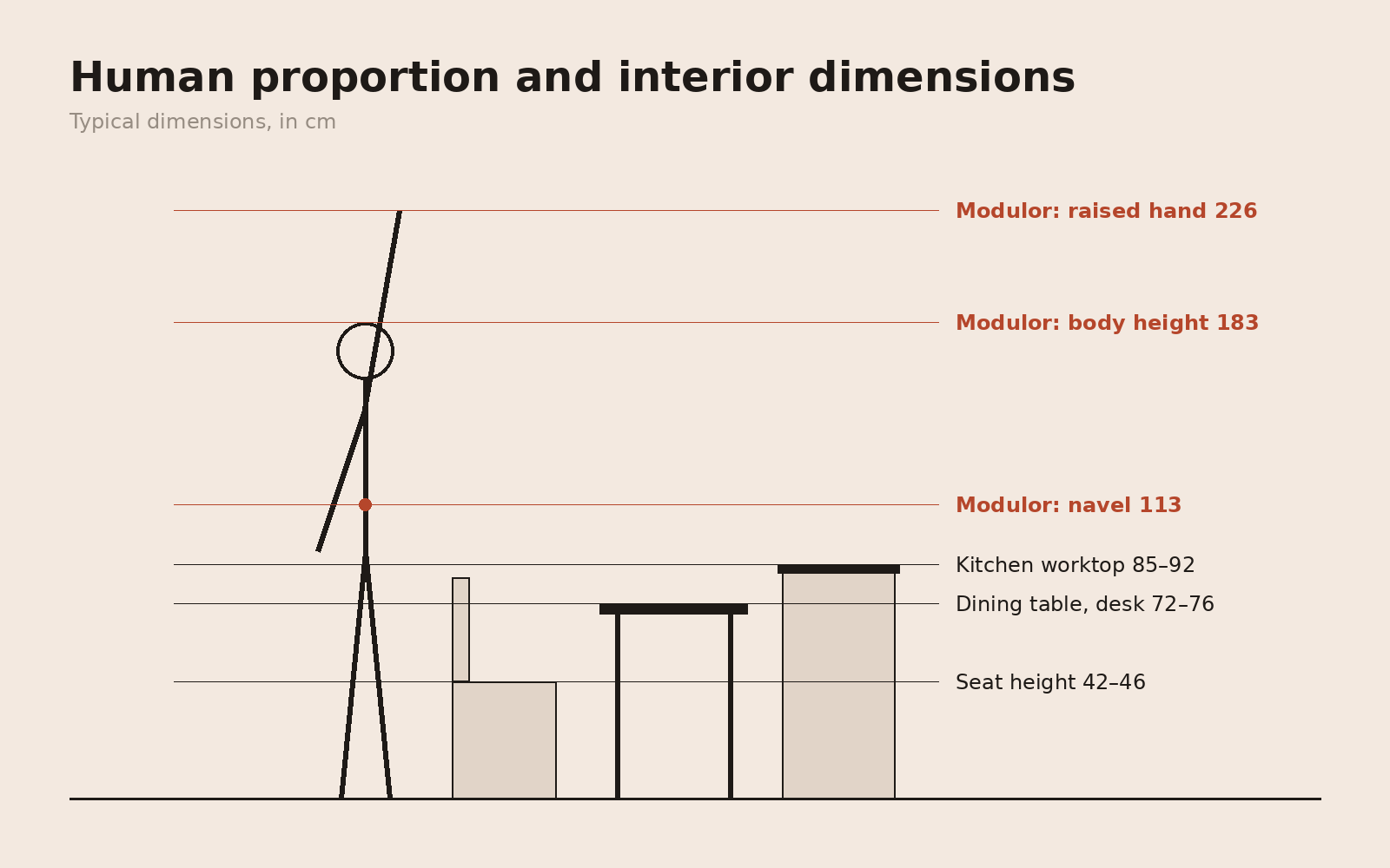
Today the same principle lives on in everyday numbers:
- Seat height: 42–46 cm
- Dining table, desk: 72–76 cm
- Kitchen worktop: 85–92 cm, depending on the cook's height
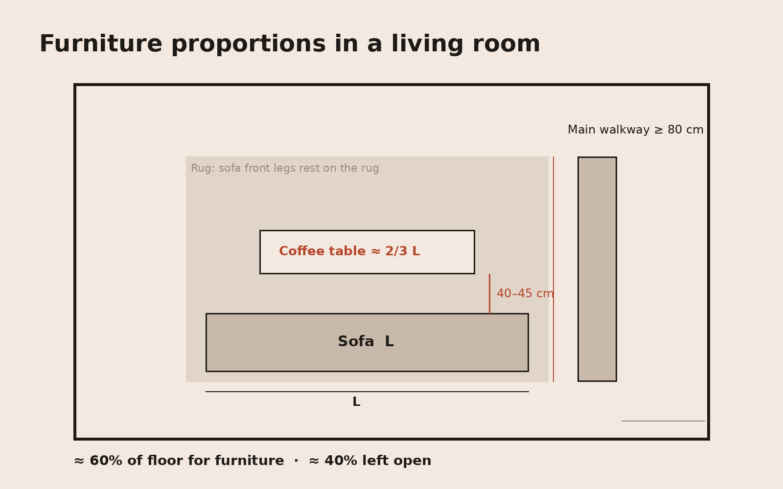
- Main walkways: at least about 80–90 cm
- Sofa to coffee table: 40–45 cm, close enough to reach without catching your legs
These numbers don't create beauty, but get them wrong and every other kind of beauty becomes uncomfortable.
Proportion between pieces
Furniture should be proportioned to each other first, then to the room. A few useful rules:
- A coffee table about two-thirds the length of the sofa.
- A rug large enough for at least the front legs of the sofa and chairs to rest on it, grouping them into one "island".
- A pendant over the dining table about half to two-thirds of the table width, hung 75–85 cm above the top.
- Art above a sofa about two-thirds of the sofa's length.
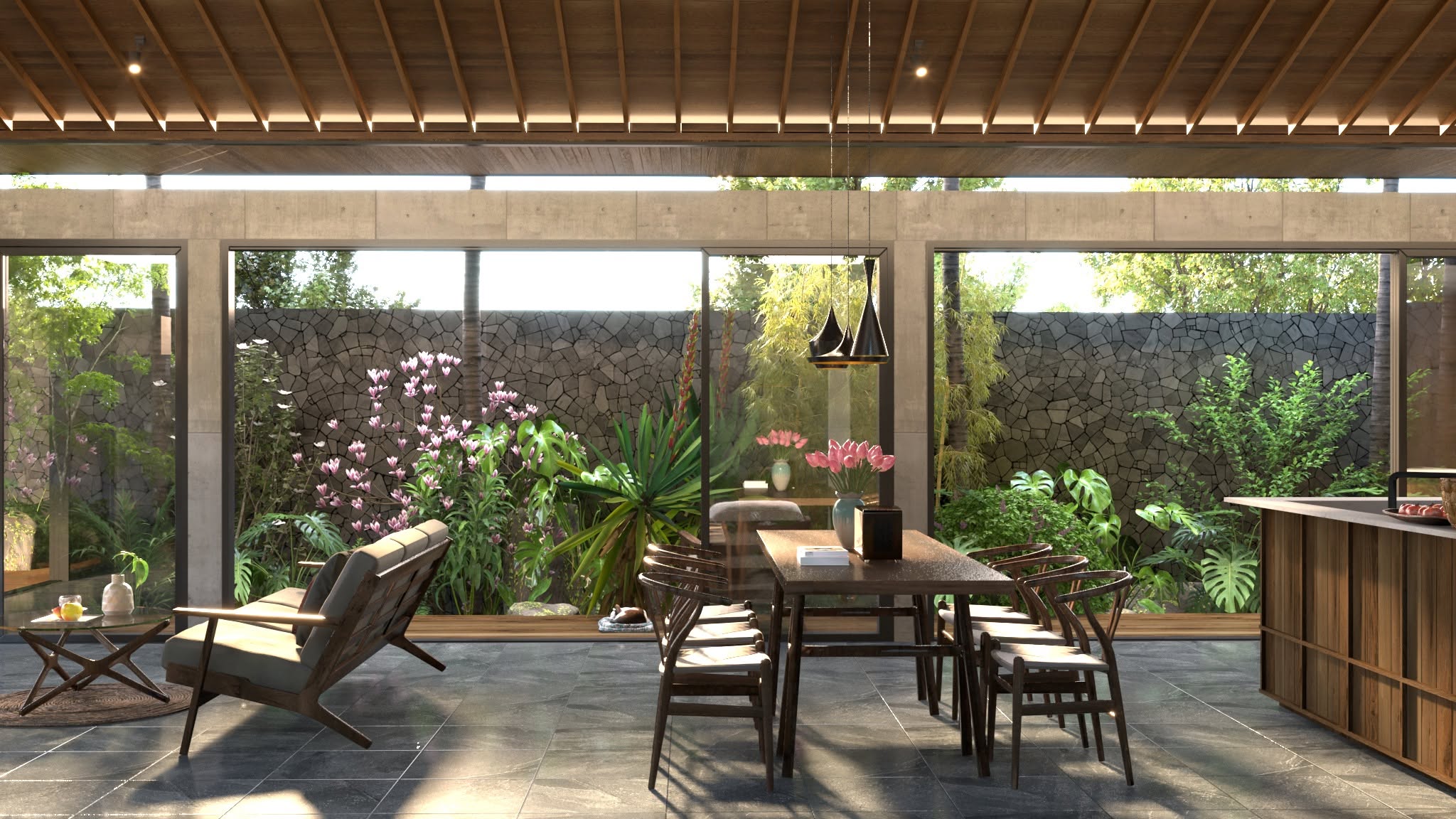
- High ceilings suit larger pieces and tall openings; with low ceilings, choose low furniture on slender legs to keep the room airy.
Proportion of colour and empty space
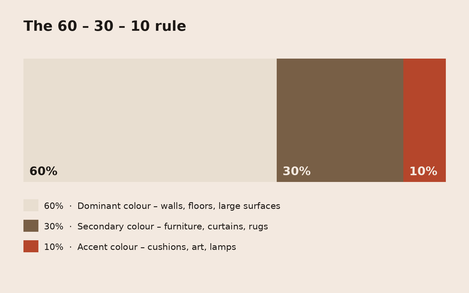
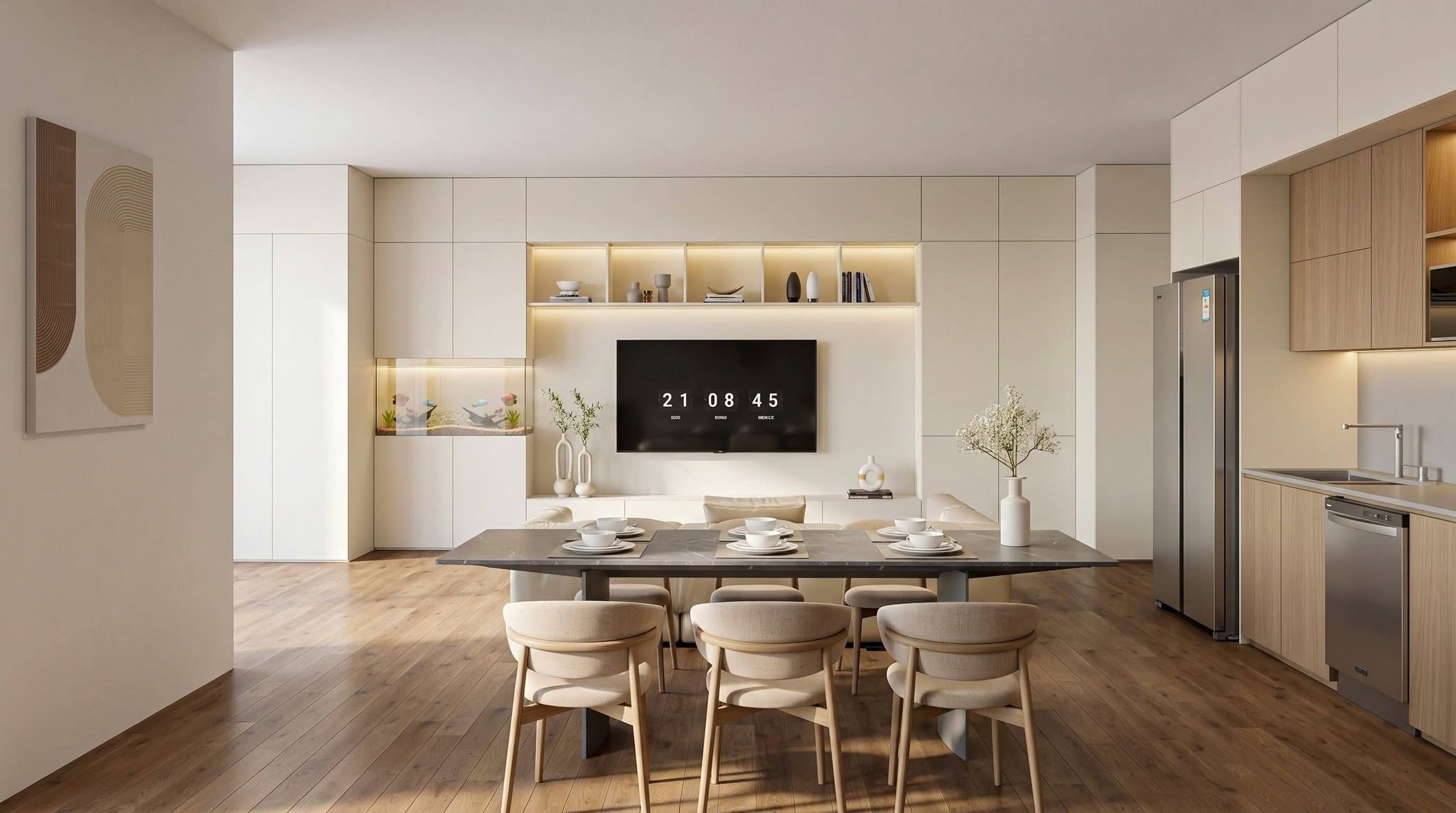
Proportion isn't only about size. The 60 – 30 – 10 rule divides colour into 60% dominant (walls, floors), 30% secondary (furniture, curtains, rugs) and 10% accent (cushions, art, lamps). Empty space is part of proportion too: a bare wall or an empty corner lets everything else be seen more clearly.
Proportion in H+ Studio's work
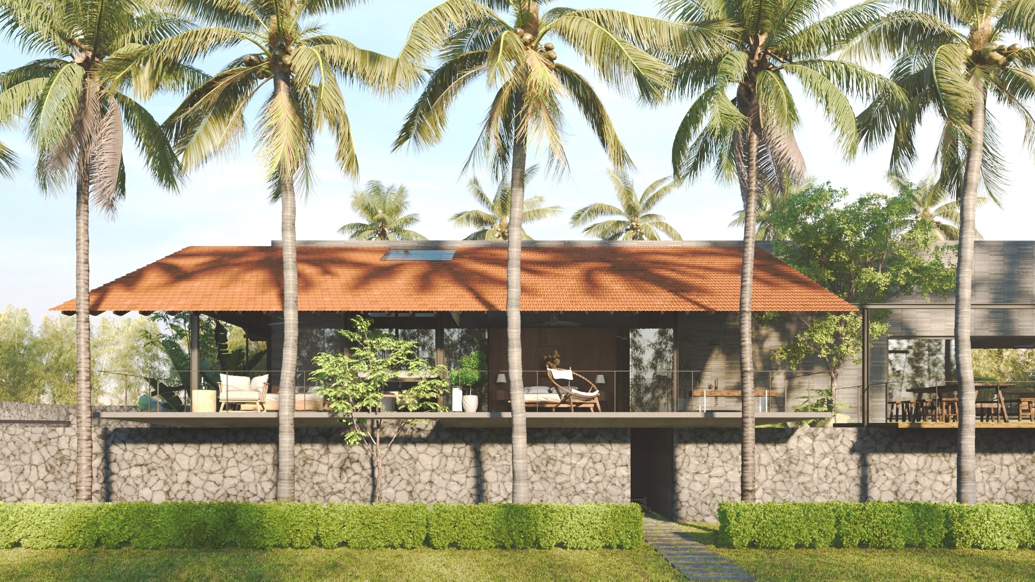
For H+, proportion starts with people and climate. Roofs are brought low and wide to shade while keeping views at eye level; ceilings rise in shared spaces to let air move, then drop over sleeping corners to feel sheltering; dining tables, thresholds and window seats are measured to how the family actually lives. The right proportion is not something residents see, but something they feel – a hard-to-name ease every time they come home.
References: Le Corbusier, Le Modulor (1948); MasterClass – How to Use Scale and Proportion for Better Interior Design. Diagrams: H+ Studio.
Related articles
All articles